- Welcome
- Solutions
- JSA Brand Storytelling
- Accor Inaugural Food & Wine Festival
- Chubb Brand Videos
- Grand Mercure Brand Refresh
- Aziamendi Branding
- 28th SEA Games SOG Branding
- Mastercard x Accor – The Ultimate Rivals
- Harry Elias Partnership Rebranding & Website
- Iniala Branding
- GPFirst Campaign
- Singapore Turf Club Riding Centre Branding
- ALL Super Transformers Event
- Experian APAC Conference Video
- Contact
JSA Brand Storytelling
JSA is a MOE Programme to identify and develop sporting talents in students at the primary school level and to help these students strengthen their overall physical competencies and motivation in sports.
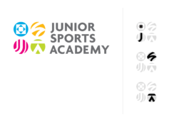
The logo is designed with the following aims in mind:
– It needs to appeal to a potentially broad audience; primarily for ages 10 to 12 years and parents
– Professional yet fun
– Projects the purpose and philosophy of JSA
– Unique from any existing Singapore sports institution
CHALLENGES:
For the Explainer Video as well as collaterals, the client was very specific that:
– No one sport should be highlighted
– No one ethnicity or gender should be singled out or seen as representative
SOLUTIONS:
– We achieve these aims by creating icons that represent each of the skill-related attributes for sports
– Each of them has a relationship with enhancing performance in sports and motor skills; so they are a good representation of the attributes required in the range of sports which the JSA offers
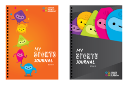
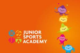
– We also created ethnically and gender neutral mascots for the collaterals
– They are inspired from the icons to further enhance the brand as well as to quickly build top-of-mind-awareness among students and parents
– The Explainer Video serves as a vehicle for us to storytell what JSA stands for and how it can help surface sporting talent in our youths
ClientJunior Sports Academy | MOEServicesBranding | Visual/Print | Animation


