- Welcome
- Solutions
- JSA Brand Storytelling
- Accor Inaugural Food & Wine Festival
- Chubb Brand Videos
- Grand Mercure Brand Refresh
- Aziamendi Branding
- 28th SEA Games SOG Branding
- Mastercard x Accor – The Ultimate Rivals
- Harry Elias Partnership Rebranding & Website
- Iniala Branding
- GPFirst Campaign
- Singapore Turf Club Riding Centre Branding
- ALL Super Transformers Event
- Experian APAC Conference Video
- Contact
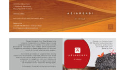
Aziamendi Branding
CHALLENGES:
– To inherit brand elements from its mother brand Azurmendi in the creation of the new brand Aziamendi for Asia
– To create a sub-brand Aziamendi 100 for its new branch in Malta
SOLUTIONS:
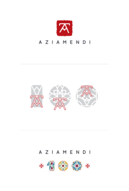
– We took the ‘A’ icon from the original Azurmendi and implant it into a visual holder that looks like a seal stamp
– Red was chosen to reflect the vibrancy of Asia
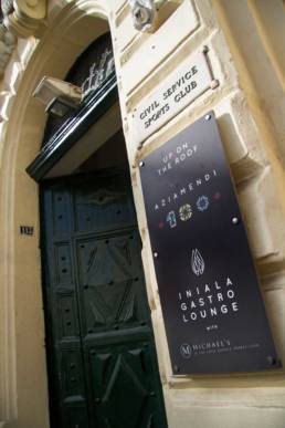
– For the Malta sub-brand Aziamendi 100, the ‘A’ icon was transformed into numerous patterns that resembled the iconic colourful tiles used in traditional Malta houses
– We also capped the 100 with two red Maltese crosses
– And for Malta only, we produced steel VIP cards that has the logo laser cut out to reflect the extra exclusivity and prestige of its membership
ClientAziamendiServicesBranding | Marketing | Visual/Print | Website
