Our Services
Strategy
Branding
Online / Offline Marketing
Technology Adoption via AR / VR
Branding
Brand Positioning
Brand Refresh
Brand Audit
Visual Identity
Messaging
Trade Dressing
Design
UI / UX
Visual / Print
AR / VR Experiences
Create
App Development
Website Development
Video Production
2D / 3D / Motion Graphics Animation
Our Solutions
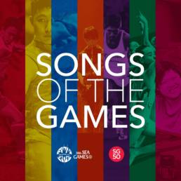
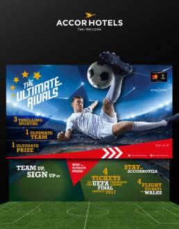
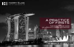
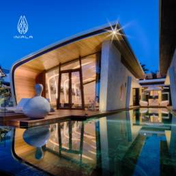
A flavour. A tease ;)


Our Clients
Our success is only possible with you